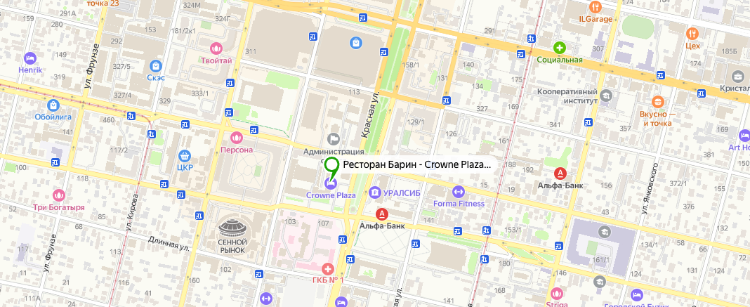
Отель Crowne Plaza Krasnodar — Centre, ул. Красная, 109
Корзина




Меню ресторана
Винная карта
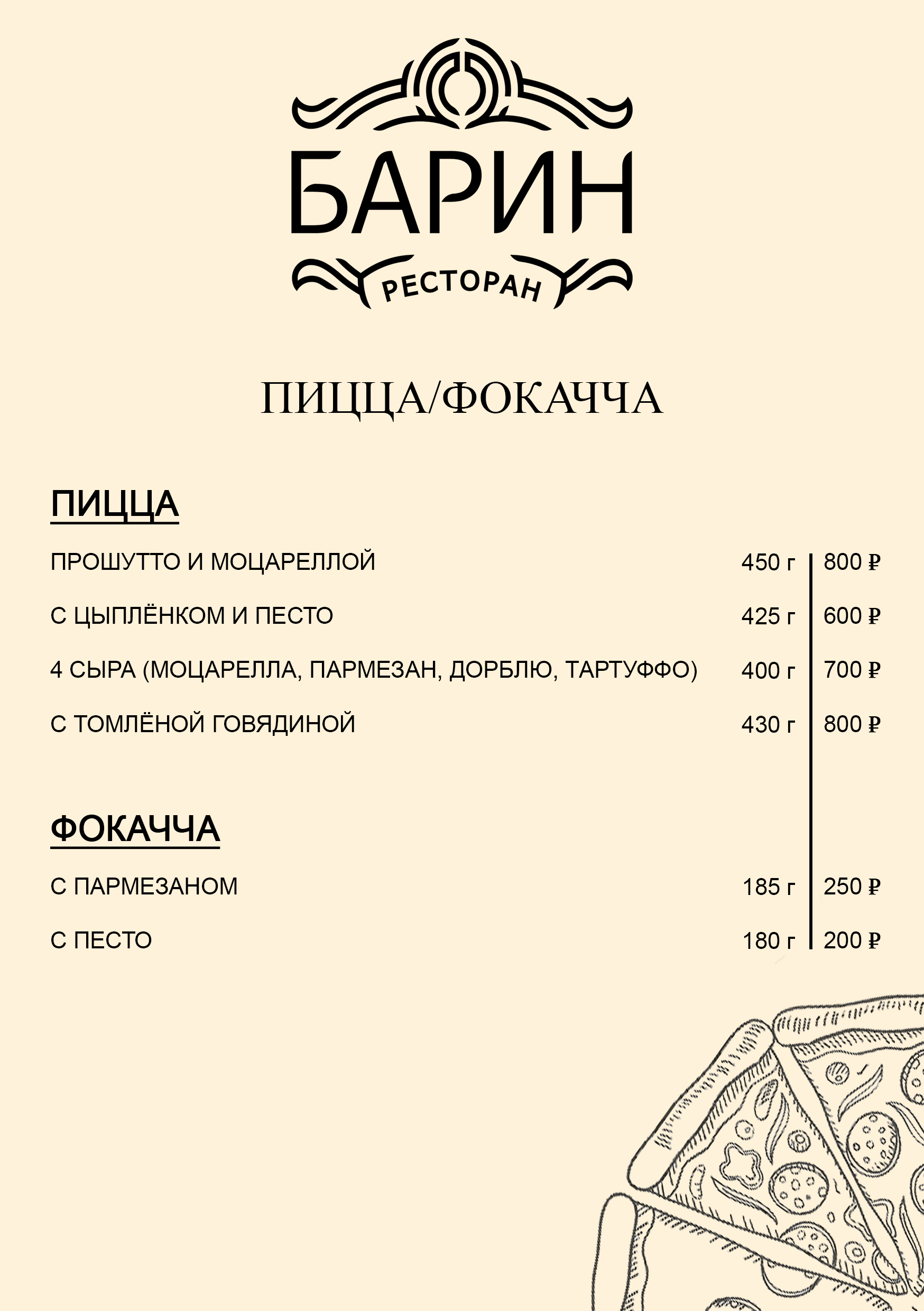
Пицца/фокачча
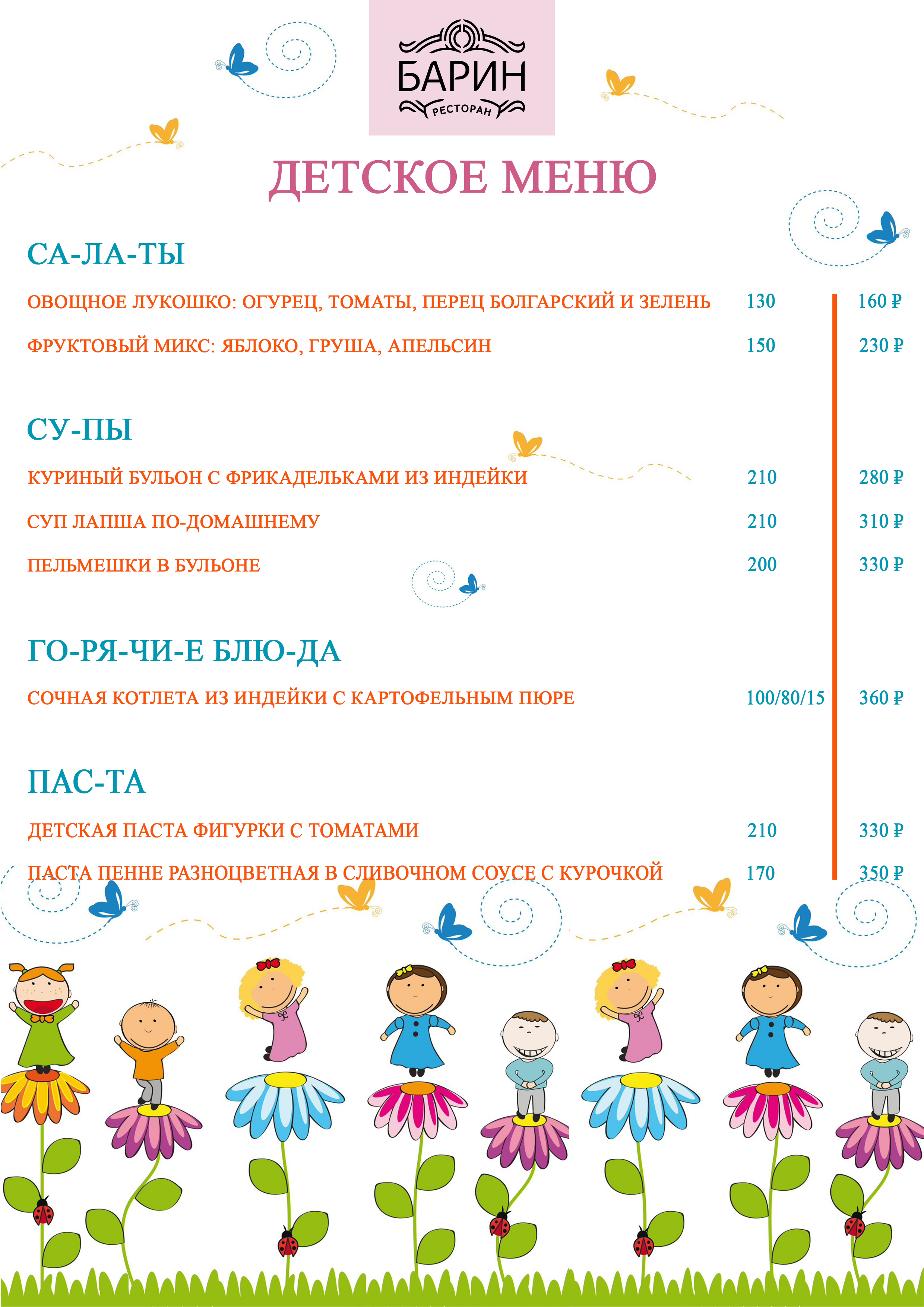
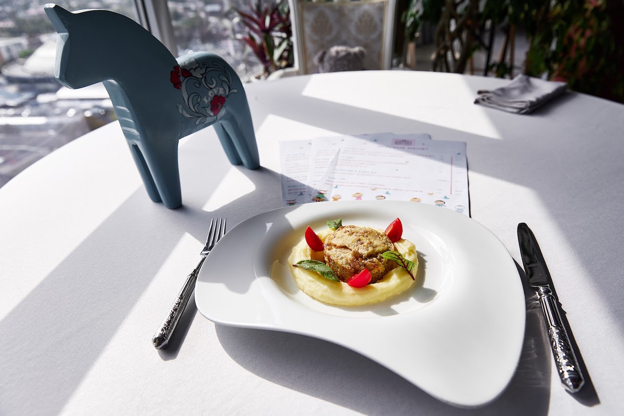
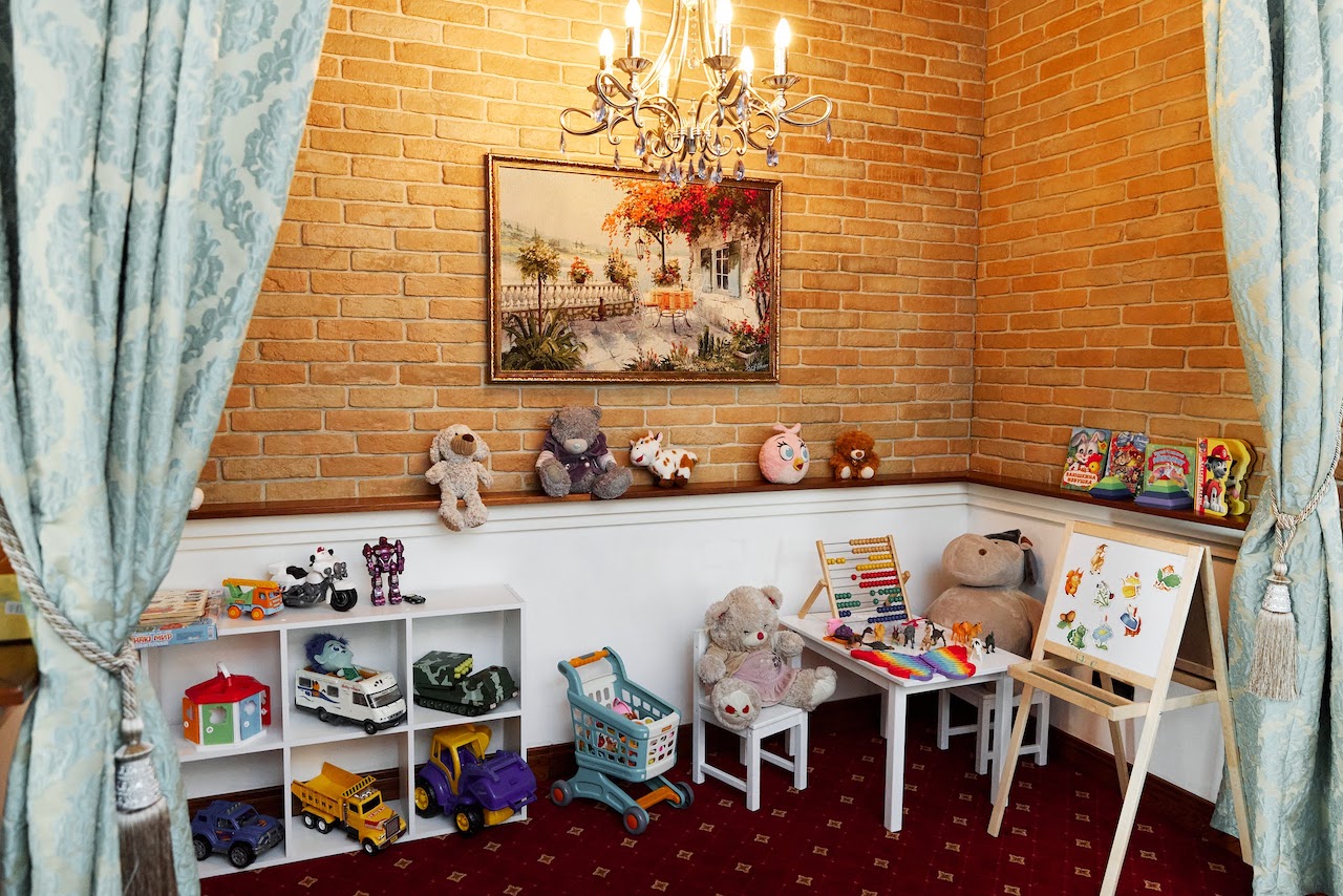
Детское меню
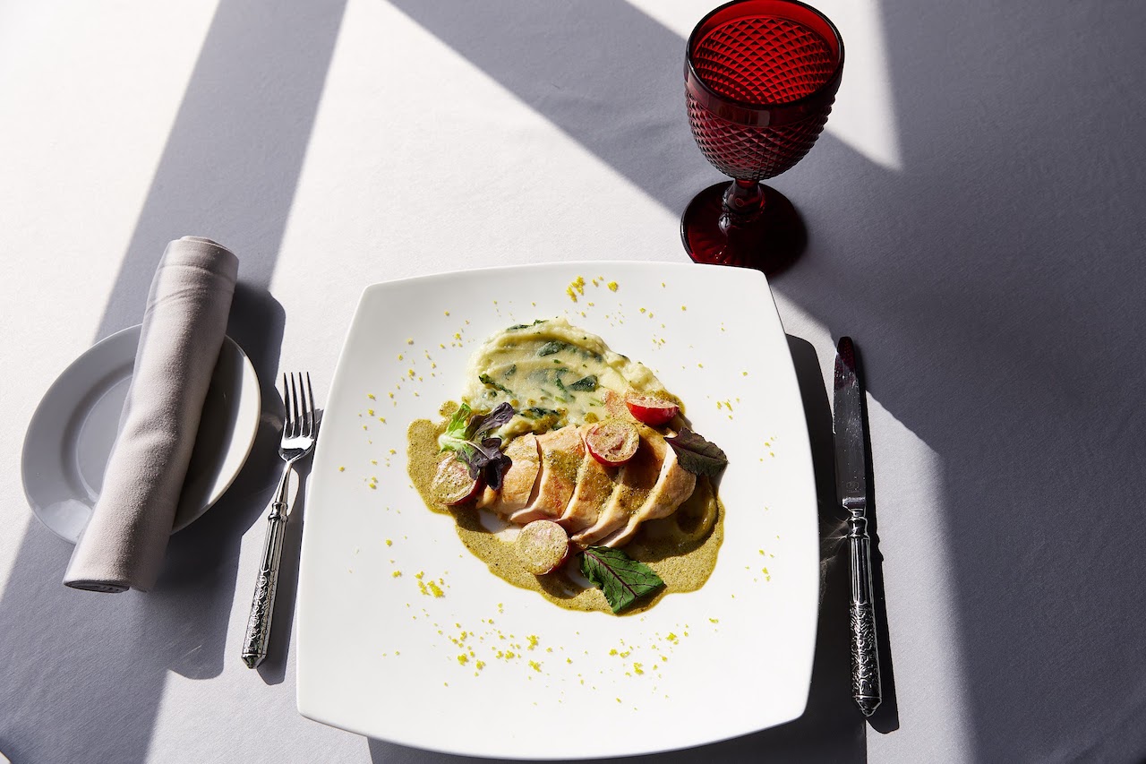
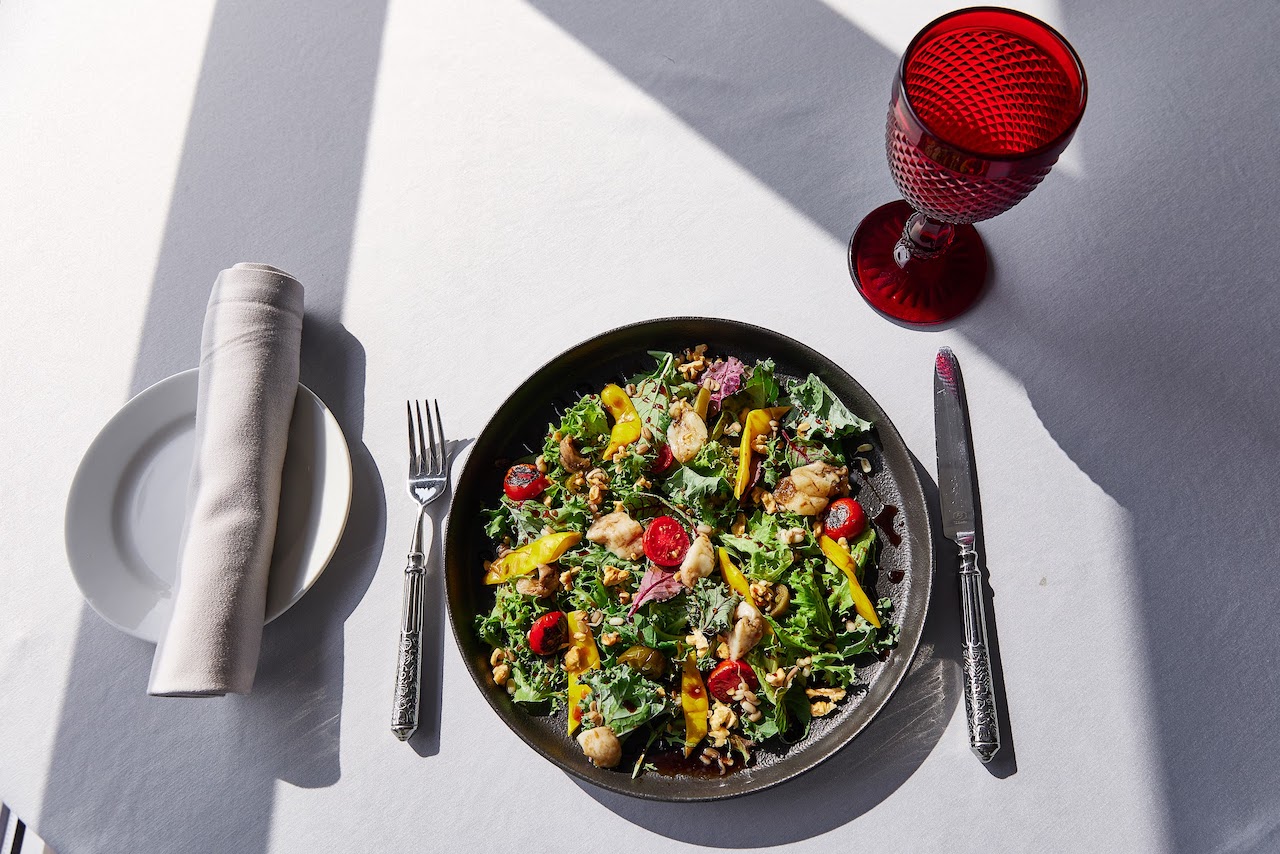
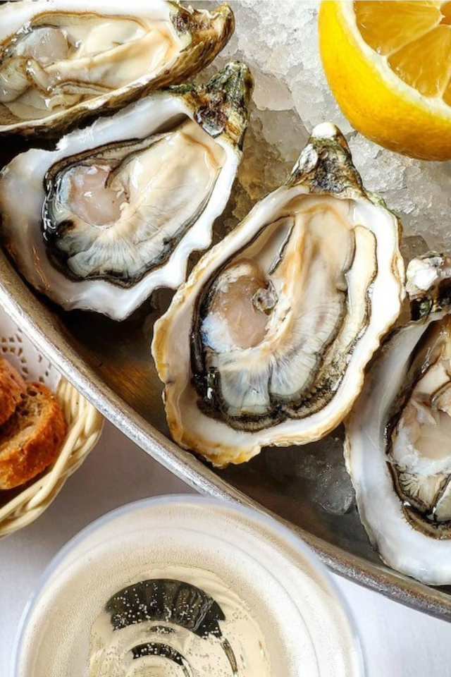
Дюжина свежайших устриц и бутылка игристого всего за 4300 рублей
Акция включает:
- бронь столика,
- заказ устриц по меню,
- бутылка игристого вина
Акция действует каждое воскресенье и понедельник

СКИДКА 10% ДЛЯ ГОСТЕЙ ОТЕЛЯ
Действует при посещении ресторана,
предъявив ключ-карту.

ДОФАМИНОВЫЙ ГАСТРОУЖИН
1 октября в 19:00 — гастроужин с панорамным видом.
Пять блюд с винным сопровождением и живой саксофон.
Стоимость билета — 5 000 ₽. Количество мест ограничено.
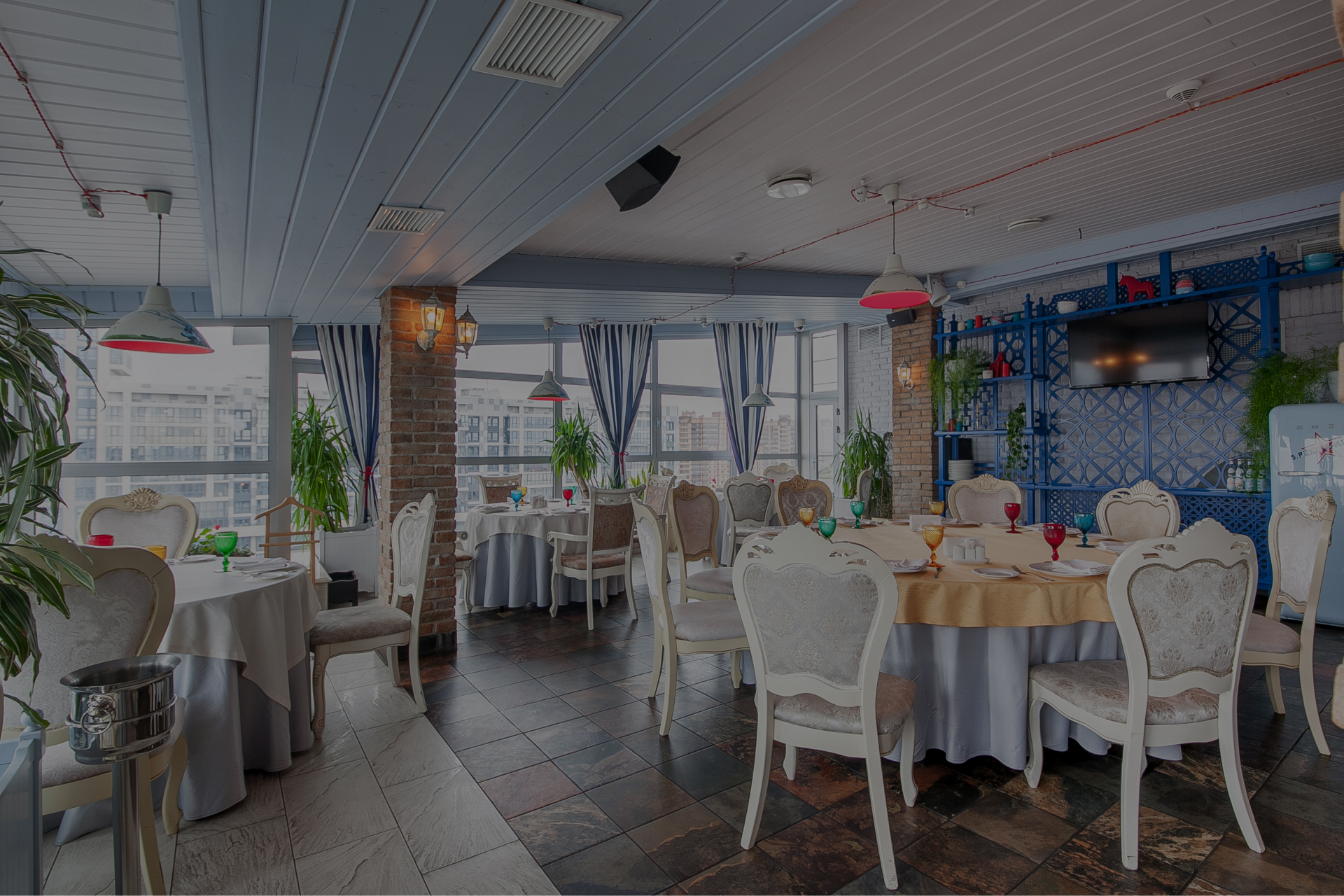
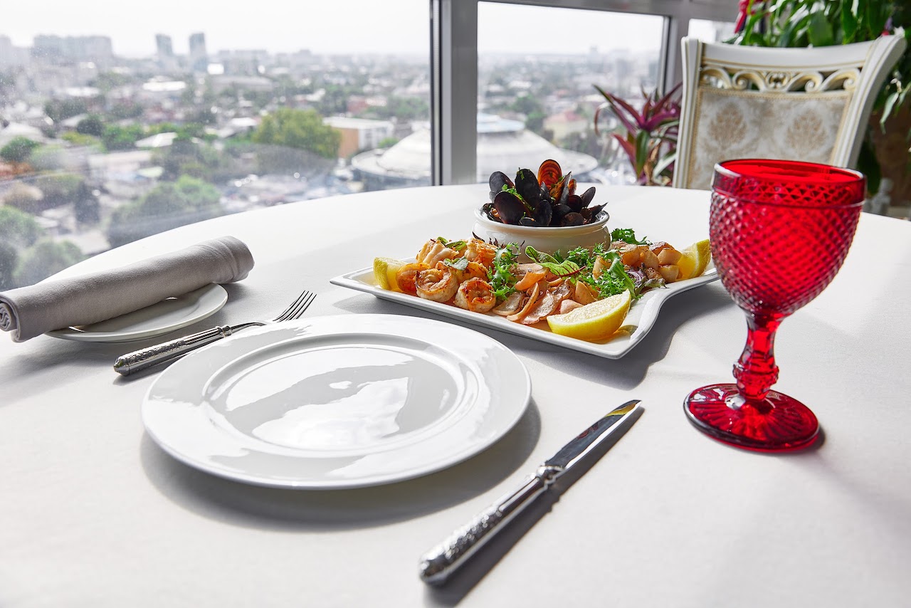
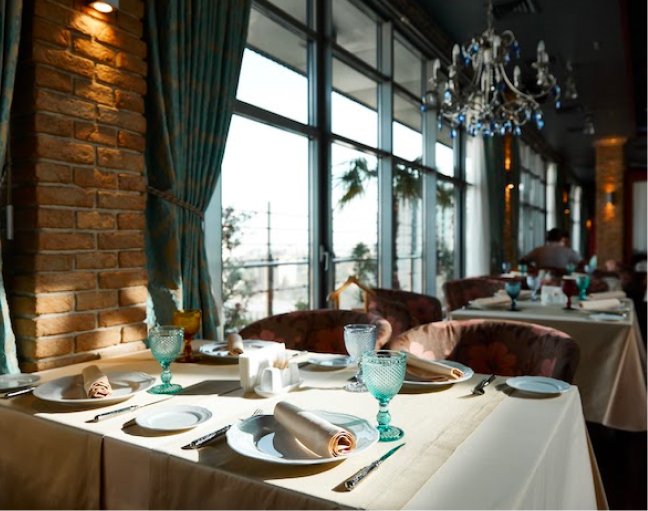
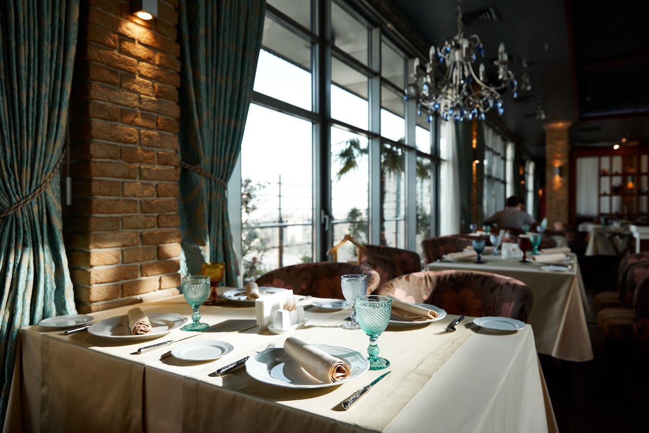
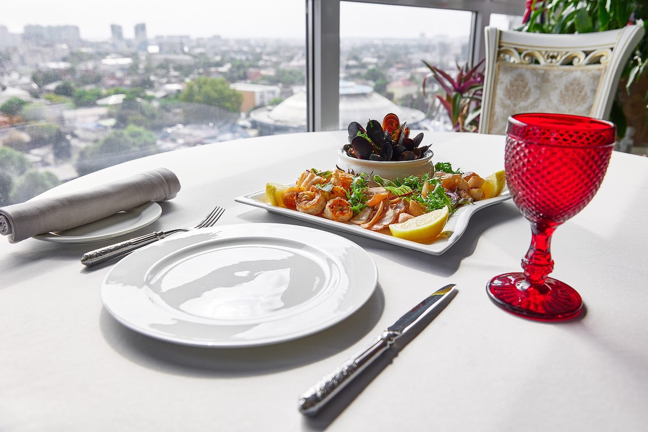
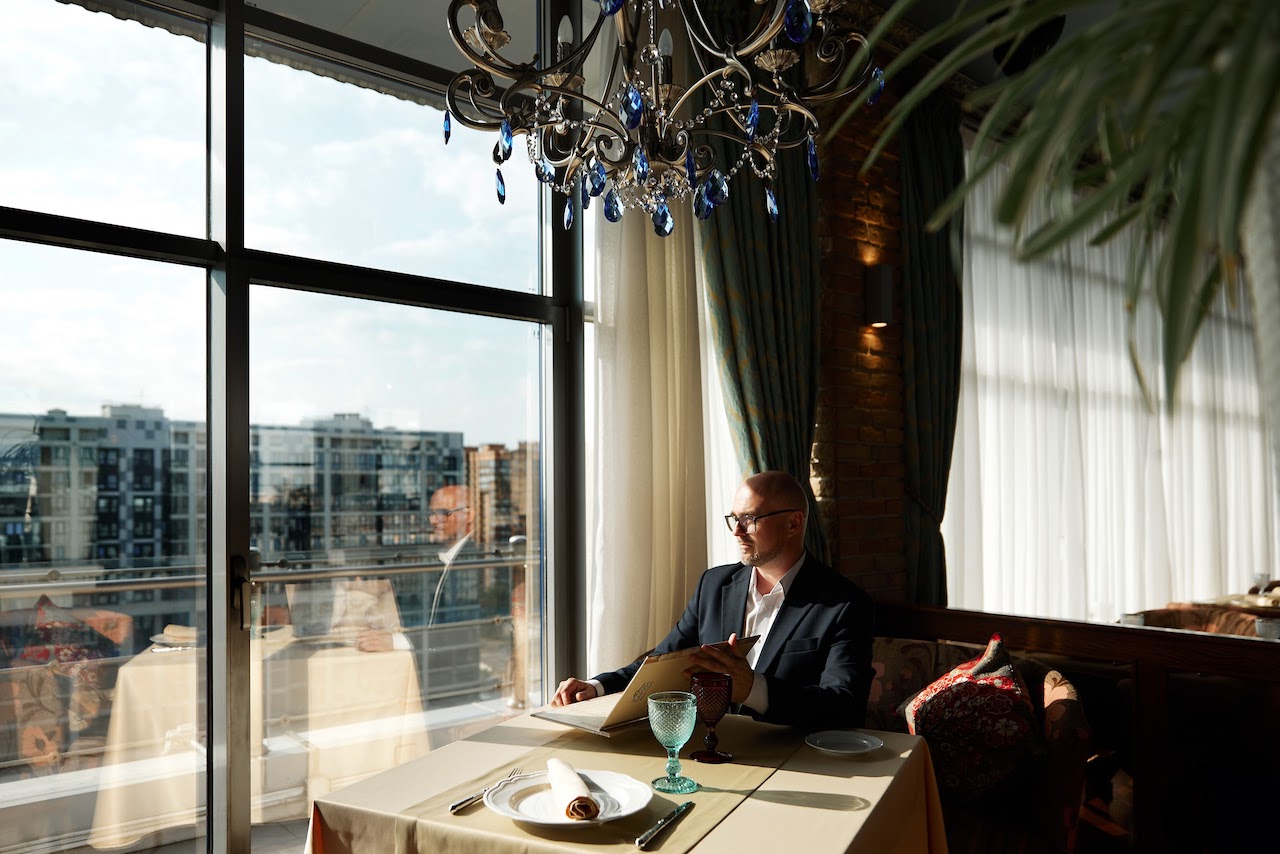
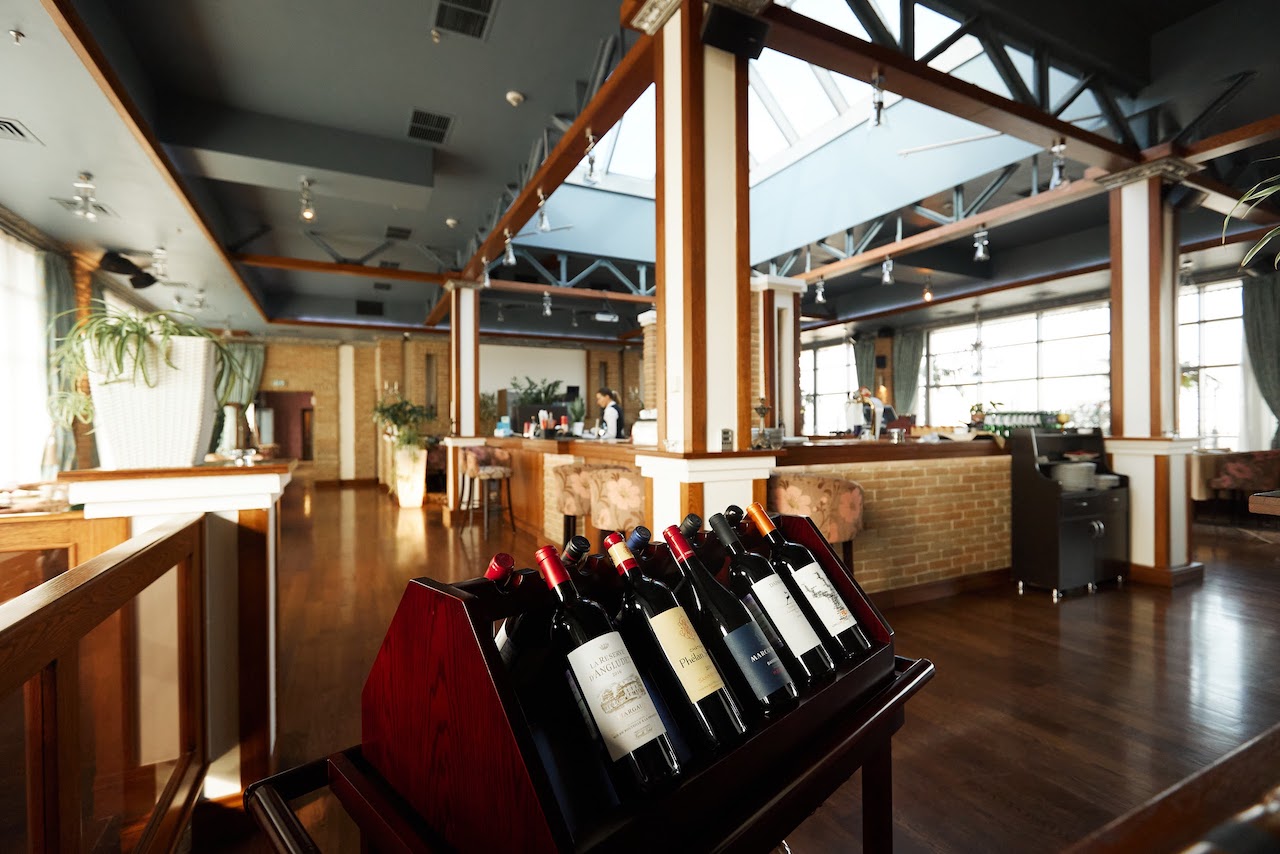
Ресторан «Барин» находится в самом центре Краснодара на 14-м этаже отеля Crowne Plaza Krasnodar-Centre c панорамным видом на город.
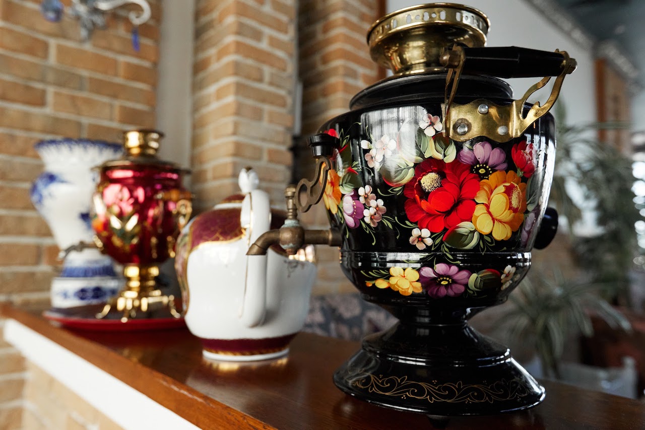
Интерьер ресторана оформлен так, что идеально подходит как для корпоративных встреч, так и для семейного ужина или незабываемого романтического свидания с видом на город с высоты птичьего полёта.
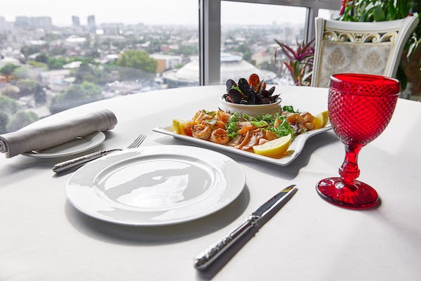
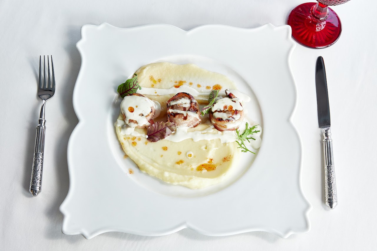
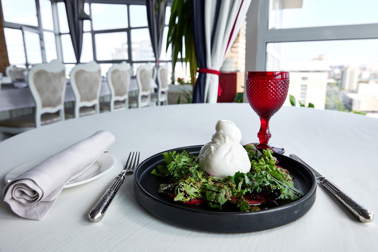
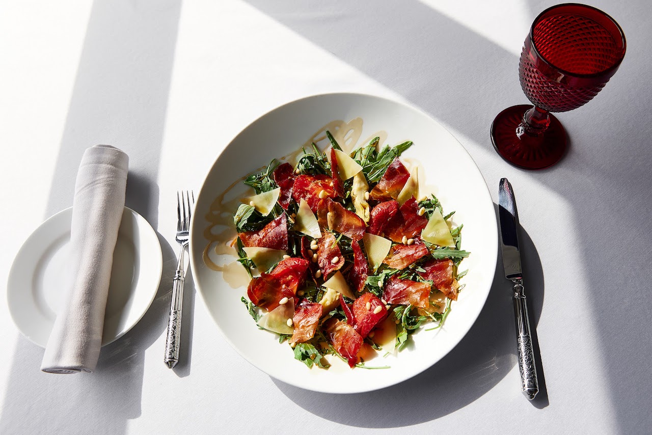
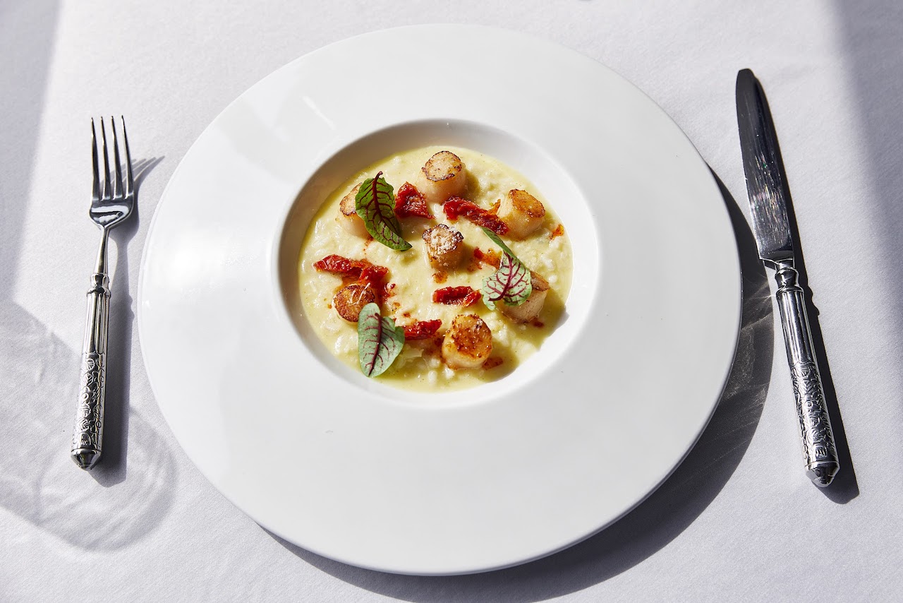
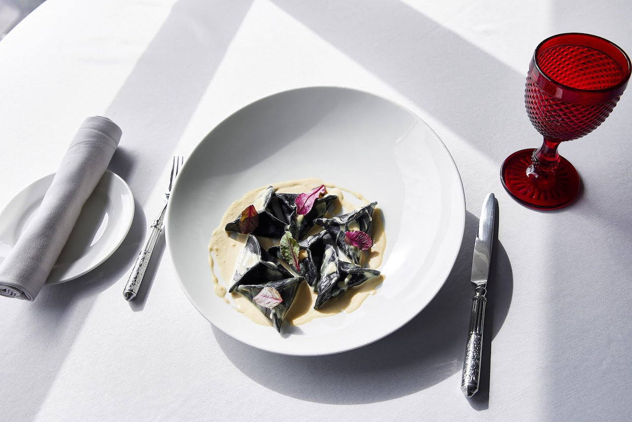
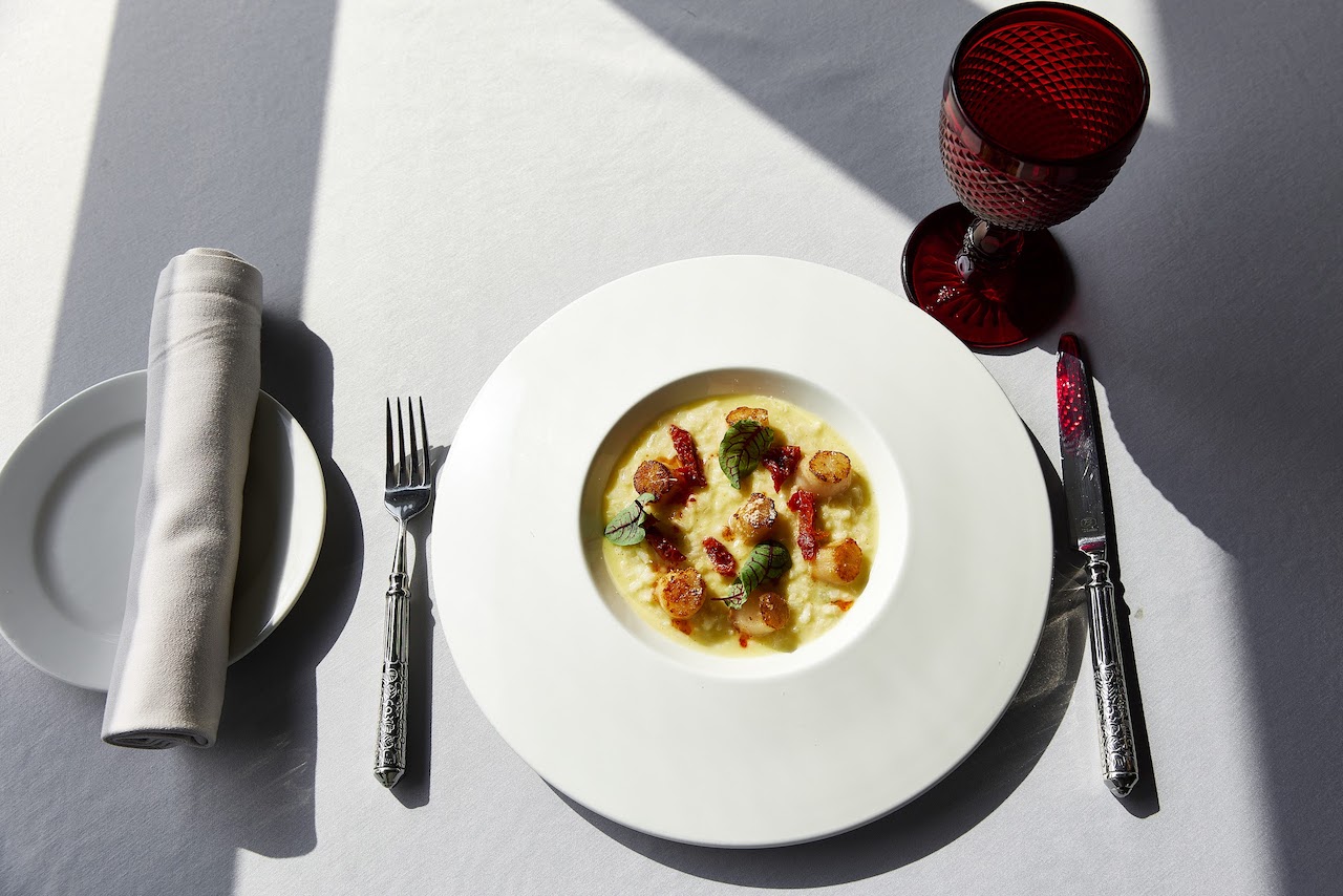
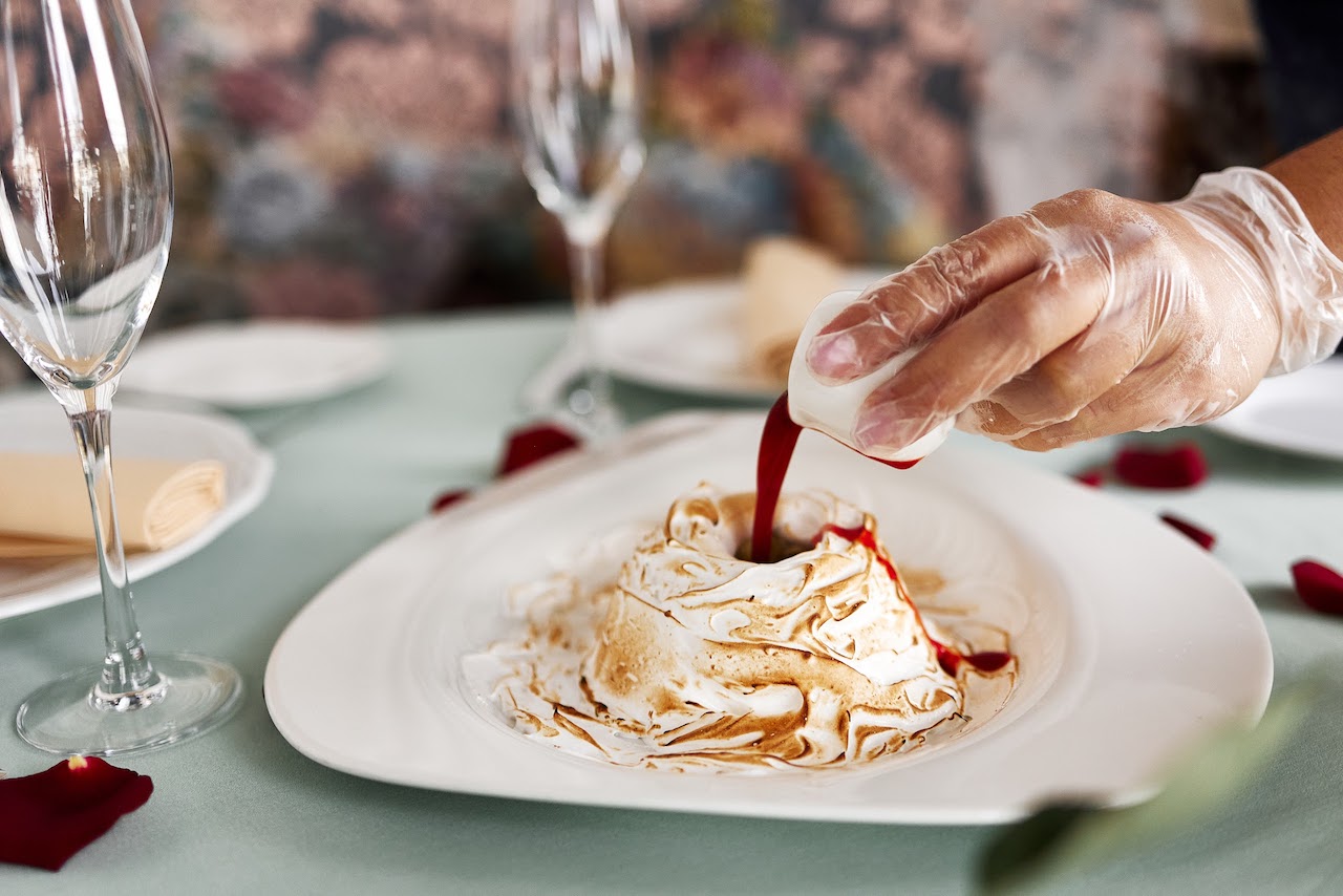
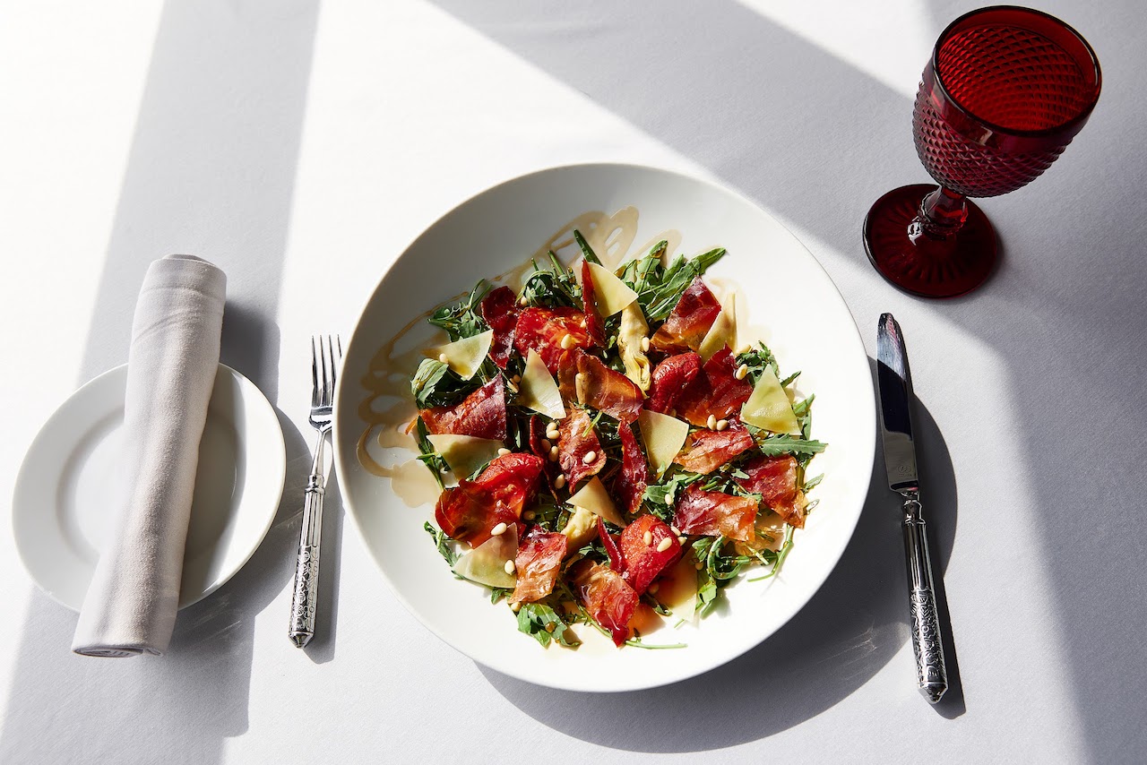
Особенностью ресторана «Барин» является оригинальная подача блюд высокой кухни. Каждое блюдо приготовлено с любовью и творчеством, а его подача выглядит как настоящее произведение искусства.
В меню предоставлены блюда средиземноморской и кубанской кухни, сохраняющие кулинарных традиций и вкусовые качества.
Сервис в ресторане «Барин» отличается высоким уровнем, а персонал всегда готов предложить гостям профессиональную помощь и рекомендации при выборе блюд и напитков.
Барин также предлагает своим гостям различные программы и акции, которые позволяют насладиться вкусной едой и напитками по выгодным ценам.

Мы рады представить вам нашего нового шеф-повара, Валентина Владимировича Остроумова. С 17 лет он погрузился в мир гастрономии и в 22 года уже занял должность шеф-повара. Сегодня, с богатым опытом в 36 лет, Валентин продолжает удивлять и вдохновлять нас своим мастерством.
Валентин работал под руководством как иностранных, так и российских шеф-поваров, что позволило ему обогатить свои навыки и расширить гастрономический кругозор. Он является членом Национальной гильдии шеф-поваров России и принимал участие в жюри кулинарного конкурса поваров ЮФО. Его опыт работы в Израиле добавил в его кулинарный арсенал уникальные техники и рецепты.
Хотя Валентин был участником шоу "На ножах", он считает, что каждый новый проект — это возможность для роста и самосовершенствования. Он стремится к искусству простоты подачи и не боится экспериментировать с сочетаниями продуктов. Обучение у талантливых шефов научило его ценить истинный вкус рыбы и уважать свежесть морепродуктов, а бескрайний север научил его находить истинную красоту в простоте.
Кубань, с её богатым разнообразием мяса, птицы, рыбы, свежих овощей и пряностей, вдохновляет Валентина на создание блюд, которые передают весь аромат и безупречный вкус местных продуктов. Каждый день он учится чему-то новому, ставя перед собой новые цели и достижения.
Приходите в "Барин" и попробуйте блюда от нашего нового шеф-повара! Мы уверены, что его кулинарные творения подарят вам незабываемые впечатления!



Настоящее Пользовательское Соглашение считается заключенным с момента совершения Пользователем одного из следующих действий:
регистрации на сайте www.barin-rest.ru (далее «Сайт»);
оформления заказа Пользователем без авторизации на Сайте;
оформления заказа по телефону Контактного Центра ресторана «Барин».
Настоящее Пользовательское Соглашение приравнивается к договору, составленному в письменной форме. Заключение Пользовательского соглашения означает, что Пользователь в необходимой для него степени ознакомился с условиями настоящего Пользовательского соглашения и полностью и безоговорочно согласен с ними, в том числе в части предоставления согласия ресторана «Барин» на обработку персональных данных Пользователя на условиях, указанных в разделе 6 настоящего Пользовательского соглашения.
1. Предмет Пользовательского Соглашения
1.1 Ресторан «Барин» предлагает Вам свои услуги на условиях, являющихся предметом настоящего Пользовательского Соглашения (ПС).
2. Описание услуг
2.1 Ресторан «Барин» является единой информационной системой заказов, которая предлагает пользователям широкие возможности для быстрого и простого поиска и заказа готовой еды. Обязательства по реализации продуктов, согласно условиям оформленного заказа Пользователя, возникают непосредственно у ресторана «Барин».
2.2 Указанные услуги носят информационный характер и оказываются Пользователю безвозмездно.
2.3 Пользователь соглашается с тем, что все услуги предоставляются без посредников и что Ресторан «Барин» несет ответственности за качество поставляемых продуктов, задержки, сбои, неверную или несвоевременную доставку, удаление или несохранность какой-либо пользовательской персональной информации.
2.4 Для того чтобы воспользоваться услугами сайта ресторана «Барин», необходимо иметь компьютер или мобильный телефон и доступ в Интернет (WWW).
2.5 Пользователь самостоятельно оформляет Заказ либо на Сайте, либо по телефону Контактного Центра ресторана «Барин».
2.6 Пользователь оплачивает заказ непосредственно при получении заказа от службы доставки ресторана «Барин» наличными денежными средствами.
3. Обязательства по оформлению заказа и пользовании сайтом
3.1 Для того чтобы воспользоваться службами ресторана «Барин», Пользователь соглашается предоставить правдивую, точную и полную информацию о себе по вопросам, предлагаемым в форме оформления заказа, заполнив ее и выразив согласие с условиями Соглашения, путем подтверждения пункта «Я принимаю условия Соглашения».
3.2 Если Пользователь предоставляет неверную информацию или у ресторана «Барин» есть серьезные основания полагать, что предоставленная им информация неверна, неполна или неточна, она имеет право приостановить либо отменить заказ пользователя и отказать ему в использовании своих служб (услуг).
4. Условия использования материалов, размещенных на сайте ресторана «Барин»
4.1 Сайт содержит материалы, охраняемые авторским правом, товарные знаки и иные охраняемые законом материалы, включая, но не ограничиваясь: тексты, фотографии, графические изображения.
4.2 При этом все содержание Сайта охраняется авторским правом как произведение, созданное коллективным творческим трудом в соответствии с законодательством Российской Федерации об авторском праве и смежных правах.
4.3 ресторана «Барин» принадлежит авторское право на использование содержания Сайта (в том числе, право на подбор, расположение, систематизацию и преобразование данных, содержащихся на сайтекомпании, а также на сами исходные данные).
4.4 Пользователь не имеет права вносить изменения, публиковать, передавать третьим лицам, участвовать в продаже или уступке, создавать производные продукты или иным образом использовать, частично или полностью, содержание Сайта.
4.5 Пользователь Сети обязуется использовать Сайт только в законных целях.
5. Права собственности ресторана «Барин» и все необходимые программы, связанные с ними, содержат конфиденциальную информацию, которая защищена законами об интеллектуальной собственности и прочими российскими и международными законами. Пользователь соглашается не модифицировать, не продавать, не распространять этот контент и программы, целиком либо по частям.
6. Конфиденциальность
6.1 Персональные данные Пользователя обрабатываются в соответствии с ФЗ «О персональных данных» №152-ФЗ и Положением о защите персональных данных Клиентов ресторана «Барин».
6.2 Предоставляя свои персональные данные при регистрации и оформлении заказа на barin-rest.ru Пользователь соглашается на их обработку в целях выполнения обязательств перед Пользователем в рамках настоящего Пользовательского соглашения, информирования Пользователей о своих услугах, контроля маркетинговых акций, клиентской поддержки, организации доставки товара Пользователям, проведения розыгрышей призов среди Пользователей, контроля удовлетворенности.
6.3 Под обработкой персональных данных понимается любое действие (операция) или совокупность действий (операций), совершаемых с использованием средств автоматизации или без использования таких средств с персональными данными, включая сбор, запись, систематизацию, накопление, хранение, уточнение (обновление, изменение) извлечение, использование и передачу курьеру.
6.4 Ресторан «Барин» несет ответственности за сведения, предоставленные Пользователем на Сайте.
6.5 Ресторан «Барин» обязуется: предотвращать попытки несанкционированного доступа к информации, полученной в ходе телефонных переговоров, и/или передачу ее третьим лицам, не имеющим непосредственного отношения к исполнению заказов в соответствие с п. 4 ст. 16 Федерального закона «Об информации, информационных технологиях и защите информации»